Here’s how your customer health score may be lying to you.

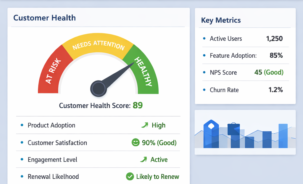
The account shows green: eighty-nine out of one hundred, but you can still lose it anyway. A detailed investigation will show why you never saw it coming.
Prominently featured at the top of most Customer Success Manager (CSM) dashboards is a number indicating whether a partner will continue the relationship and/or renew for the next business year. It’s typically data from platform usage: logins, support tickets, and Net Promoter Score (NPS) responses. This shows green when the number is high (preferred), red when low (danger looming), and amber where there’s confusion categorizing it. It is called a Health Score, and the data reading can be grossly misleading.
The issue is the assumption driving the reporting of these numbers; that a higher reported number equals positive activity and by default translates into a safer account. Sadly, that’s not always the case.
One customer may be active on a platform and still cancel by end of the year. While another may barely login in 3 months because the tool is deeply integrated in their workflow that they don’t need to think about it. The health score applies same metrics to both; the first is healthy, and the second, at risk of renewal. Both reports can be inaccurate.
Measuring Health Scores
Health score is built on proxies. The usage data informs the frequency of engaging the product, not the actual value-driven activity. NPS captures user sentiment not direct proof of value realization. Support ticket volume is an indication of friction in product usage. A customer who rarely calls for support might be disengage rather than assuming they’re largely successful at using the product.
Cumulatively, these data points are informative. The main issue is treating them as the truth, aggregating them and assigning a number used to benchmark the health or otherwise of an account.
At renewal, a customer’s key question is “did this product contribute significant value to my operations?” not “did I use this product?” A health score largely answers the second while teams fumble around the first. It’s important to note that it’s easy to measure activity than it is, value.
Three instances where green may mean nothing
This is visible in few specific ways worth naming.
A power user with no budget influence
The health score shows heavy activity in the account from one or few people in the partner organization. The power user(s) however wield(s) no budgetary authority in renewal/expansion discussions. This responsibility sits with a higher authority who has zero to limited knowledge of the product but is required to sign the contract.
Polite Exit
This customer manages the relationship gracefully to an end without unnecessary confrontation and room for further discussion. They pretend all is well after the product has failed to meet expectations on multiple support tickets. To keep things moving along, they login periodically, unenthusiastically join meetings and respond to calls. But mentally, they’re done with the relationship.
The metrics show stable usage data and neutral NPS possibly making the dashboard green. The awakening email comes a few weeks to renewal when it’s too late to salvage the relationship.
The missing executive sponsor
The executive sponsor is reassigned or exits the organization unbeknownst to the vendor.
The team nonetheless continue with product usage out of habit but not because anyone is monitoring the value it contributes knowing very well switching between tools can be cumbersome.
The absence of the executive sponsor creates a vacuum: no active local champion to defend continued funding of the product during internal budget review. Here, product usage metrics looks fine built from measuring activity. The health score sees the activity but not the absence of advocacy to that drives renewal and expansion.
The question that can replace dashboard checks
There is a key diagnostic to the health score. This unfortunately cannot be automated. It’s a question which reads:
"Is the customer getting more than what they’re actually paying for?"
This question forces a conversation. The answer reveals whether an account is safe. To get to this, leverage the relationship with the key contact person to identify real win situations where the product has contributed to specific business outcome within this or the last quarter. Such qualitative unstructured responses are difficult to track but are the real gems in helping to tag which accounts are healthy, and predicting which ones will renew.
Recommended use of health score data
The health score dashboard is not worthless: nothing from the forgoing indicates the same. This data should serve as the first filter to uncover accounts requiring special attention from the ones that do not. It’s only problematic when used as a single tool to determine health or otherwise of an account. Essentially, it’s the starting point for conversation but not a replacement for one.
For every green score, the question should be “what will I see if I drill down the numbers?” And for each time the score drops, the question should be “what was already wrong that the score is now surfacing?”
Keep in mind that a green score investigated is worth something. On the other hand, a green score simply accepted is a ticking time bomb.
Like what you just read?
This is what I write for CS leaders; in their voice, and for their audience.